What is the FP København font?
Copenhagen has been in need of a typeface that unites the city’s many visual expressions.
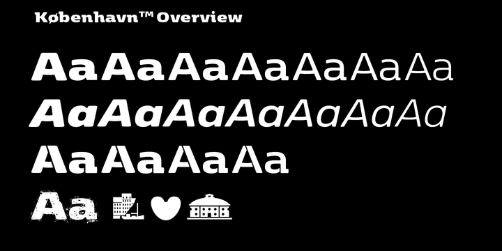
The three designers Morten Rostgaard Olsen, Henrik Birkvig and Ole Søndergaard have designed and developed the typeface FP København. Now available from MyFonts in 20 styles: Uprights & Italics,
small caps, pictos-characters, stencils, sprayed style, OT-features, ligatures, contextual alternates etc.
The shapes of the letters are inspired by the city’s culture and the visual environment and design in Denmark in the 20th century. More…
It is relatively low and wide as the city itself and with rounded corners that give it a warm visual mood.
“You can find examples of the use of a typeface with the same purpose in other parts of the world, for example, to identify local areas or urban tourism materials. FP København is our take on that kind of typeface” the designers add.
FP København Font families
The FP København includes the following font families:
- København Light
- København Light Italic
- København Regular
- København Regular Italic
- København SemiBold
- København SemiBold Italic
- København Bold
- København Bold Italic
- København Extra Bold
- København Extra Bold Italic
- København Black
- København Black Italic
- Kobenhavn Extra Black
- Kobenhavn Extra Black Italic
- København Bold Stencil
- København Extra Bold Stencil
- Kobenhavn Black Stencil
- Kobenhavn Stencil Extra Black
- Kobenhavn Sprayed Sprayed
- København Pictos
FP København Preview
Here is a preview of how FP København will look. For more previews using your own text as an example, click here.
