AT Move Decoupe Font
alphabet
0 Styles
André Toet, Jasper Nijssen
Kind words and forgiveness are better than charity followed by hurt
0
0 reviews
Best usage: Headline, Logo, Presentation
No Styles
AT Move Decoupe Examples
48pxKind words and forgiveness are better than charity followed by hurt
36pxKind words and forgiveness are better than charity followed by hurt
32pxKind words and forgiveness are better than charity followed by hurt
20pxNo one shall be subjected to arbitrary arrest, detention or exile. Everyone is entitled in full equality to a fair and public hearing by an independent and impartial tribunal, in the determination of his rights and obligations and of any criminal charge against him. No one shall be subjected to arbitrary interference with his privacy, family, home or correspondence, nor to attacks upon his honour and reputation. Everyone has the right to the protection of the law against such interference or attacks.
16pxEveryone has the right to freedom of thought, conscience and religion; this right includes freedom to change his religion or belief, and freedom, either alone or in community with others and in public or private, to manifest his religion or belief in teaching, practice, worship and observance. Everyone has the right to freedom of opinion and expression; this right includes freedom to hold opinions without interference and to seek, receive and impart information and ideas through any media and regardless of frontiers. Everyone has the right to rest and leisure, including reasonable limitation of working hours and periodic holidays with pay.
Recently Added
About AT Move Decoupe
Details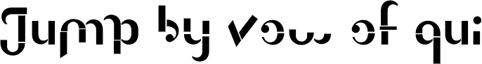
What is the AT Move Decoupe font?
Découpé Based on a French children’s play from 1906. In a car boot sale André Toet found a funny looking box containing a lot of cut out cardboard figures, in fact it looked a bit like a geometric puzzle! He played around a bit and succeeded to create a workable typeface with it ! The interesting thing about this particular font is, that in fact it’s organized chaos. The 26 letters of the alphabet are a mix between caps and lowercases, so within one word caps and lowercases will be used next to each other. It’s a very useful font for different projects. Concept/Art Direction/Design: André Toet © 2017AT Move Decoupe Font families
The AT Move Decoupe includes the following font families: [font-families]AT Move Decoupe Preview
Here is a preview of how AT Move Decoupe will look. For more previews using your own text as an example, click here.Font NameAT Move Decoupe
Design Date1 Jan 2012
Designer(s)André Toet, Jasper Nijssen
PublisherAndré Toet Design
AT Move Decoupe Glyphs
No Data
Language support
0 languages available