What is the Rail font?
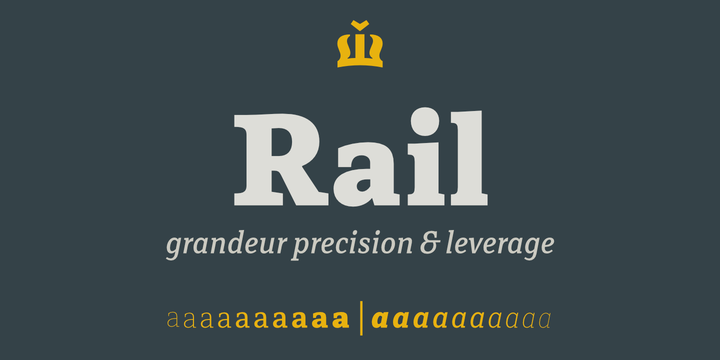
Rail is the best conveyance mechanism for your written communication. Precision, innovation and experience are the main foundation for this grandeur slab serif. It’s designed to provide great comfort and reduce any possible friction for your eyes. It’s highly recommended for complex typography projects like magazines and annual reports as well as for signs, headers and other inscriptions.
The precise construction of this slab serif signals the greater effectiveness of the letters that are coupled together in a beautiful harmony. Its construction is very legible, pleasant and familiar.
The typeface’s x-height is approximately 68% of its capitals. Rail italic is constructed at 11° angle. It is developed to provide real italic construction but enhanced with mechanical appearance. This makes the whole typeface very special and recognizable.
Rail Font families
The Rail includes the following font families:
- Rail Thin
- Rail Thin Italic
- Rail Ultra Light
- Rail Ultra Light Italic
- Rail Extra Light
- Rail Extra Light Italic
- Rail Light
- Rail Light Italic
- Rail Regular
- Rail Italic
- Rail Caption
- Rail Caption Italic
- Rail Medium
- Rail Medium Italic
- Rail Bold
- Rail Bold Italic
- Rail Extra Bold
- Rail Extra Bold Italic
- Rail Black
- Rail Black Italic
Rail Preview
Here is a preview of how Rail will look. For more previews using your own text as an example, click here.
