PR Vanaheim Font
all
0 Styles
Peter Rempel
Kind words and forgiveness are better than charity followed by hurt
0
0 reviews
Best usage: Headline, Web, Logo
No Styles
PR Vanaheim Examples
48pxKind words and forgiveness are better than charity followed by hurt
36pxKind words and forgiveness are better than charity followed by hurt
32pxKind words and forgiveness are better than charity followed by hurt
20pxNo one shall be subjected to arbitrary arrest, detention or exile. Everyone is entitled in full equality to a fair and public hearing by an independent and impartial tribunal, in the determination of his rights and obligations and of any criminal charge against him. No one shall be subjected to arbitrary interference with his privacy, family, home or correspondence, nor to attacks upon his honour and reputation. Everyone has the right to the protection of the law against such interference or attacks.
16pxEveryone has the right to freedom of thought, conscience and religion; this right includes freedom to change his religion or belief, and freedom, either alone or in community with others and in public or private, to manifest his religion or belief in teaching, practice, worship and observance. Everyone has the right to freedom of opinion and expression; this right includes freedom to hold opinions without interference and to seek, receive and impart information and ideas through any media and regardless of frontiers. Everyone has the right to rest and leisure, including reasonable limitation of working hours and periodic holidays with pay.
Recently Added
About PR Vanaheim
Details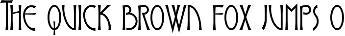
What is the PR Vanaheim font?
This is a perfect font for historical or fantasy titles. It is influenced by ancient Nordic runes. the strokes flare slightly, to a concave terminal for a finely carved appearance. There are two sets of capitals in PR-Vanaheim-DC (Dual Capitals); one set of narrow letters, more closely related to Runic forms, and one set which includes wider and circular letters, which can be freely combined with the narrow letters for the variety associated with hand lettering. There is one version with dots placed in the centre of large counters and one version without the dots. The broad caps character set includes characters which allow for tight spacing; a dropped L, and a tall T. More… There are also two different lowercase sets, one modern, and one archaic, all of which can be freely mixed to fine tune the appearance of your text. Here is the brief description of the available faces: PR-Vanaheim-Med-DC-01 Duplex Caps PR-Vanaheim-Med-DC-02 Duplex Caps, Dotted counters and dot space PR-Vanaheim-Med-DC-03 Duplex Caps, Dotted counters PR-Vanaheim-Med-LC-04 Broad Caps, with modern style lower case. PR-Vanaheim-Med-LC-05 Narrow Caps, with modern style lower case. PR-Vanaheim-Med-LC-06 Broad Caps, with archaic lower case. PR-Vanaheim-Med-LC-07 Narrow Caps, with archaic lower case.PR Vanaheim Font families
The PR Vanaheim font includes the following font families: [font-families]PR Vanaheim Preview
Here is a preview of how PR Vanaheim will look. For more previews using your own text as an example, click here.Font NamePR Vanaheim
Design Date1 Jan 2014
Designer(s)Peter Rempel
PublisherPR Fonts
PR Vanaheim Glyphs
No Data
Language support
0 languages available