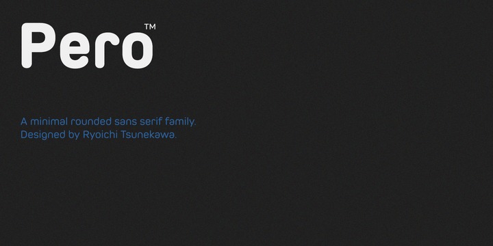
What is the Pero™ font?
Pero is a condensed rounded sans-serif family designed by Ryoichi Tsunekawa and the whole family consists of 7 weights from ExtraLight to ExtraBold.The range of styles provides flexibility for title, headline and body text. And the large x-heights add to legibility.
The basic skeleton of the letterform was designed modularly and minimalized by removing unnecessary stems and ends were rounded out.
The minimalized modular design gives this family contemporary urbane taste and rounded corners make this family warm and friendly. This rounded feature will also accentuate your design work moderately. More…
Pero supports almost all European languages: Western, Central, South Eastern Europeans and afrikaans. And superior figures, inferior figures, denominators, numerators and fraction can be accessed by using OpenType features.
Pero™ Font families
The Pero™ includes the following font families:
- Pero Extra Light
- Pero Light
- Pero Semi Light
- Pero Regular
- Pero Semi Bold
- Pero Bold
- Pero Extra Bold
Pero™ Preview
Here is a preview of how Pero™ will look. For more previews using your own text as an example, click here.

Is Pero™ A free font? Is Pero™ Free to Download?
No,Pero™ is not free to download. You will need to pay for it I'm afraid.
Almost every font that we list on HighFonts.com is a paid-for, premium font. We do have a Free Fonts section where we list free fonts that you can download.
There is no point trying to find a free download of Pero™ so please don't waste your time looking.
It is highly unlikely that you'll be able to find Pero™ for free. There's a lot of websites that will say "Free Download" but these are just attempts to get you to click on a link which will either take you to an ad landing page or you risk getting viruses on your computer. In the rare occasion that you do find a free download for Pero™ remember that it's illegal to use a font if you didn't pay for it!
If you really want Pero™ and you want to truly own it the legal and safe way, then click here to visit the download and purchase page on MyFonts.com. Here you will be able to obtain the proper license. The designer and publisher deserves to be paid for their work, as they have put in the hours and the creativity to produce such an amazing font. Good luck with your purchase and future use of this font. :)