What is the Lorimer No 2 Condensed™ font?
Lorimer No 2 is a sans family designed for display settings. Narrow letters, tight spacing, and a low x-height make Lorimer No. 2 better suited to display settings than fonts adjusted to work in text settings. Packaging, identities, and headlines are ideal applications for Lorimer No 2.
Designer James Puckett developed Lorimer No. 2 as the result of researching nineteenth century memorial inscriptions. A condensed sans serif inscription on a Manhattan burial vault prompted research and experimentation. Research turned up similar letters in American wood type, memorials in an Indian cathedral, and enameled tiles in the New York City subway. Puckett developed his experiments into a type family with two widths, five weights, and matching italics.
Lorimer No 2 Condensed™ Font families
The Lorimer No 2 Condensed™ includes the following font families:
- Lorimer No 2 Condensed Light
- Lorimer No 2 Condensed Light Italic
- Lorimer No 2 Condensed Medium
- Lorimer No 2 Condensed Medium Italic
- Lorimer No 2 Condensed SemiBold
- Lorimer No 2 Condensed SemiBold Italic
- Lorimer No 2 Condensed Bold
- Lorimer No 2 Condensed Bold Italic
- Lorimer No 2 Condensed Black
- Lorimer No 2 Condensed Black Italic
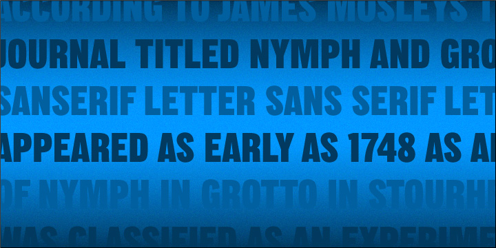
Lorimer No 2 Condensed™ Preview
Here is a preview of how Lorimer No 2 Condensed™ will look. For more previews using your own text as an example, click here.
