Loxley™ Font
aged
0 Styles
Jim Rimmer
Kind words and forgiveness are better than charity followed by hurt
0
0 reviews
Best usage: Headline, Logo, Web
No Styles
Loxley™ Examples
48pxKind words and forgiveness are better than charity followed by hurt
36pxKind words and forgiveness are better than charity followed by hurt
32pxKind words and forgiveness are better than charity followed by hurt
20pxNo one shall be subjected to arbitrary arrest, detention or exile. Everyone is entitled in full equality to a fair and public hearing by an independent and impartial tribunal, in the determination of his rights and obligations and of any criminal charge against him. No one shall be subjected to arbitrary interference with his privacy, family, home or correspondence, nor to attacks upon his honour and reputation. Everyone has the right to the protection of the law against such interference or attacks.
16pxEveryone has the right to freedom of thought, conscience and religion; this right includes freedom to change his religion or belief, and freedom, either alone or in community with others and in public or private, to manifest his religion or belief in teaching, practice, worship and observance. Everyone has the right to freedom of opinion and expression; this right includes freedom to hold opinions without interference and to seek, receive and impart information and ideas through any media and regardless of frontiers. Everyone has the right to rest and leisure, including reasonable limitation of working hours and periodic holidays with pay.
Recently Added
About Loxley™
Details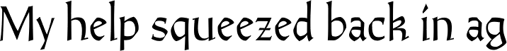
What is the Loxley™ font?
Drawn shortly before Jim Rimmer’s passing in 2010, Loxley was designed to be used in a fine press edition of the folklore story of Robin Hood. It was named after the cited birthplace of the story’s classic hero. Loxley’s shapes were inspired the same early Roman faces (such as Subiaco from the late 1400s) that influenced Frederick Goudy’s Aries, Franciscan and Goudry Thirty types. It exhibits the preculiarities of Jim’s left-handed calligraphy, as well as his outside-the-box thinking with exit strokes and serif variations. More… Loxley was remastered for the latest technologies in 2013. Now it comes with a character set of over 450 glyphs, including plenty of stylistic alternates, a full compliment of f-ligatures, a Th-ligature, basic fractions, ordinals, a long s for historic setting, comprehensive class-based kerning, and extended Latin language support. 20% of this font’s revenues will be donated to the Canada Type Scholarship Fund, supporting higher typography education in Canada.Loxley™ Font families
The Loxley™ includes the following font families: [font-families]Loxley™ Preview
Here is a preview of how Loxley™ will look. For more previews using your own text as an example, click here.Font NameLoxley™
Design Date1 Jan 2013
Designer(s)Jim Rimmer
PublisherCanada Type
Loxley™ Glyphs
No Data
Language support
0 languages available