Goupil Font
aerial
0 Styles
Régis Tosetti
Kind words and forgiveness are better than charity followed by hurt
0
0 reviews
Best usage: Body, Headline, Logo
No Styles
Goupil Examples
48pxKind words and forgiveness are better than charity followed by hurt
36pxKind words and forgiveness are better than charity followed by hurt
32pxKind words and forgiveness are better than charity followed by hurt
20pxNo one shall be subjected to arbitrary arrest, detention or exile. Everyone is entitled in full equality to a fair and public hearing by an independent and impartial tribunal, in the determination of his rights and obligations and of any criminal charge against him. No one shall be subjected to arbitrary interference with his privacy, family, home or correspondence, nor to attacks upon his honour and reputation. Everyone has the right to the protection of the law against such interference or attacks.
16pxEveryone has the right to freedom of thought, conscience and religion; this right includes freedom to change his religion or belief, and freedom, either alone or in community with others and in public or private, to manifest his religion or belief in teaching, practice, worship and observance. Everyone has the right to freedom of opinion and expression; this right includes freedom to hold opinions without interference and to seek, receive and impart information and ideas through any media and regardless of frontiers. Everyone has the right to rest and leisure, including reasonable limitation of working hours and periodic holidays with pay.
Recently Added
About Goupil
Details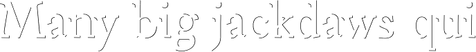
What is the Goupil font?
Goupil is based on baroque proportions letters. But, it can only be read through its thin shadows. So, Goupil is a light face, for refined and aerial titles. Titling face does not necessary mean poorly furnished character: Goupil also has small capitals, separate of the rest of the font in the Standard version, included in one file in the Pro version.Goupil Font families
The Goupil includes the following font families: [font-families]Goupil Preview
Here is a preview of how Goupil will look. For more previews using your own text as an example, click here.Font NameGoupil
Design Date1 Jan 2008
Designer(s)Régis Tosetti
PublisherNonpareille
Goupil Glyphs
No Data
Language support
0 languages available