What is the Gardner Sans font?
Gardner Sans is a humanist sans serif with a range of weights, italics, small caps stylistics alternates and a set of decorative ornaments. The light and regular faces work at smaller sizes and the heavier weights are good for display lettering.
It is inspired by a few historical sources including Stephenson Blakes’ Granby, Gill Sans, as well as some old hand-done lettering for sales tickets. The name (and the basis for the small caps) derives in-particular from the Roy Gardner collection of sales tickets from early 20th century that can be found on spitalfieldslife.com The heavier weights were particularly influenced by a later cut of Gill Sans, Extra Bold 321. The italic is more of a contemporary mix of humanist styles.
Gardner Sans Font families
The Gardner Sans includes the following font families:
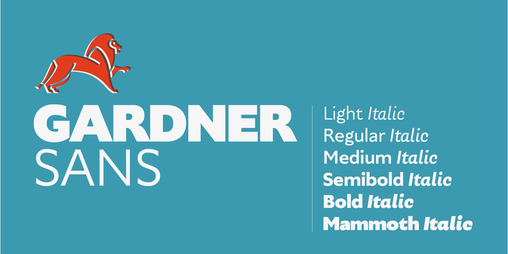
- Gardner Sans Light
- Gardner Sans Light Italic
- Gardner Sans Regular
- Gardner Sans Italic
- Gardner Sans Medium
- Gardner Sans Medium Italic
- Gardner Sans Semibold
- Gardner Sans Semibold Italic
- Gardner Sans Bold
- Gardner Sans Bold Italic
- Gardner Sans Mammoth
- Gardner Sans Mammoth Italic
Gardner Sans Preview
Here is a preview of how Gardner Sans will look. For more previews using your own text as an example, click here.
