Isabelle Pro™ Font
all
0 Styles
Jim Rimmer
Kind words and forgiveness are better than charity followed by hurt
0
0 reviews
Best usage: Books, Headline, Logo
No Styles
Isabelle Pro™ Examples
48pxKind words and forgiveness are better than charity followed by hurt
36pxKind words and forgiveness are better than charity followed by hurt
32pxKind words and forgiveness are better than charity followed by hurt
20pxNo one shall be subjected to arbitrary arrest, detention or exile. Everyone is entitled in full equality to a fair and public hearing by an independent and impartial tribunal, in the determination of his rights and obligations and of any criminal charge against him. No one shall be subjected to arbitrary interference with his privacy, family, home or correspondence, nor to attacks upon his honour and reputation. Everyone has the right to the protection of the law against such interference or attacks.
16pxEveryone has the right to freedom of thought, conscience and religion; this right includes freedom to change his religion or belief, and freedom, either alone or in community with others and in public or private, to manifest his religion or belief in teaching, practice, worship and observance. Everyone has the right to freedom of opinion and expression; this right includes freedom to hold opinions without interference and to seek, receive and impart information and ideas through any media and regardless of frontiers. Everyone has the right to rest and leisure, including reasonable limitation of working hours and periodic holidays with pay.
Recently Added
About Isabelle Pro™
Details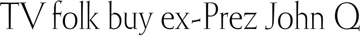
What is the Isabelle Pro™ font?
Isabelle is the closest thing to a metal type revival Jim Rimmer ever did. The original metal face was designed and cut in late 1930s Germany, but its propspects were cut short by the arrival of the war. This was one of Jim’s favourite faces, most likely because of the refined art deco elements that reminded him of his youthful enthusiasm about everything press-related, and the face’s intricately thought balance between calligraphy and typography. Not to mention one of the most beautiful italics ever made. More… Jim’s early 2000s digitization included mathematical corrections to the original metal cut, as well as some functional improvements for digital use. In 2013, during the remastering of the entire Rimmer collection, Isabelle underwent a considerable rethinking/expansion and was rechristened Isabelle Pro. The new revisions include small caps, ligatures, seven types of figures, automatic fractions, extended Latin language support, stylistic alternates that include lowercase serif angle options in the roman and looped ascenders/descenders in the italic, and plenty of extra OpenType features like caps-to-small-caps substitution, case-sensitive positioning, ordinals, and extended class-based kerning. Now each of the Isabelle Pro fonts includes over 680 glyphs. 20% of this font’s revenues will be donated to the Canada Type Scholarship Fund, supporting higher typography education in Canada.Isabelle Pro™ Font families
The Isabelle Pro™ includes the following font families: [font-families]Isabelle Pro™ Preview
Here is a preview of how Isabelle Pro™ will look. For more previews using your own text as an example, click here.Font NameIsabelle Pro™
Design Date1 Jan 2013
Designer(s)Jim Rimmer
PublisherCanada Type
Isabelle Pro™ Glyphs
No Data
Language support
0 languages available