What is the Directors Cut Pro font?
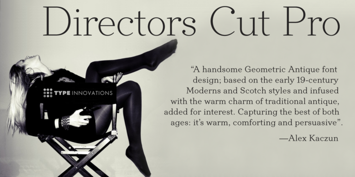
Directors Cut Pro is a compelling new font series designed by Alex Kaczun. It recently won the second place—a commendation in the Canberra Typeface Competition. This handsome Geometric Antique serif design is based on the early 19-century Moderns and Scotch styles, infused with the warm charm of traditional antique, added for interest. Capturing the best of both ages: it’s warm, comforting and persuasive.
Directors Cut Pro’s graceful aspects naturally invite uses at large sizes, for which we have created a stunning and elegant lighter weight. But, this workhorse typeface series incorporates a solid regular weight, along with its italic—ideal for a multitude of text purposes, at varying point sizes. A robust Bold weight is available for headlines and emphasis. More…
Director Cut Pro comes with proportional as well as tabular lining figures for quickly setting up charts and tables. It also contains an extended character set—including most Central European languages. Alex Kaczun is in the process of expanding this typeface series to include additional weights, styles and proportions. Stay tuned!
The large Pro font character set supports most Central European and many Eastern European languages.
Directors Cut Pro Font families
The Directors Cut Pro includes the following font families:
- Directors Cut Pro Light
- Directors Cut Pro Light Italic
- Directors Cut Pro
- Directors Cut Pro Italic
- Directors Cut Pro Bold
- Directors Cut Pro Bold Italic
Directors Cut Pro Preview
Here is a preview of how Directors Cut Pro will look. For more previews using your own text as an example, click here.
