Credit Card Font Font
Free
10 Styles
K-Type
Kind words and forgiveness are better than charity followed by hurt
0
0 reviews
Best usage: Headline, Logo, UX/UI Design
Credit Card Font Styles
Type Something
Regular 400
Regular 400
Regular 400
Regular 400
Regular 400
Regular 400
Regular 400
Regular 400
Regular 400
Regular 400
Credit Card Font Examples
48pxKind words and forgiveness are better than charity followed by hurt
36pxKind words and forgiveness are better than charity followed by hurt
32pxKind words and forgiveness are better than charity followed by hurt
20pxNo one shall be subjected to arbitrary arrest, detention or exile. Everyone is entitled in full equality to a fair and public hearing by an independent and impartial tribunal, in the determination of his rights and obligations and of any criminal charge against him. No one shall be subjected to arbitrary interference with his privacy, family, home or correspondence, nor to attacks upon his honour and reputation. Everyone has the right to the protection of the law against such interference or attacks.
16pxEveryone has the right to freedom of thought, conscience and religion; this right includes freedom to change his religion or belief, and freedom, either alone or in community with others and in public or private, to manifest his religion or belief in teaching, practice, worship and observance. Everyone has the right to freedom of opinion and expression; this right includes freedom to hold opinions without interference and to seek, receive and impart information and ideas through any media and regardless of frontiers. Everyone has the right to rest and leisure, including reasonable limitation of working hours and periodic holidays with pay.
Recently Added
About Credit Card Font
Details
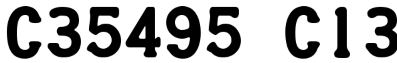
There is a standard (and standardised – ISO 7811 & ISO 1073 – I think) font embossed on most (if not all) major credit cards (Visa, Mastercard, Amex, Discover, etc.). It’s designed to be easily transferable between mediums while maintaining legibility, kind of like a typewriter: carved, moulded, punched, pressed, stamped, printed, traced, etched, embossed, etc. It’s also designed to be easily discernable, tangibly by the blind, and optically for computer recognition.
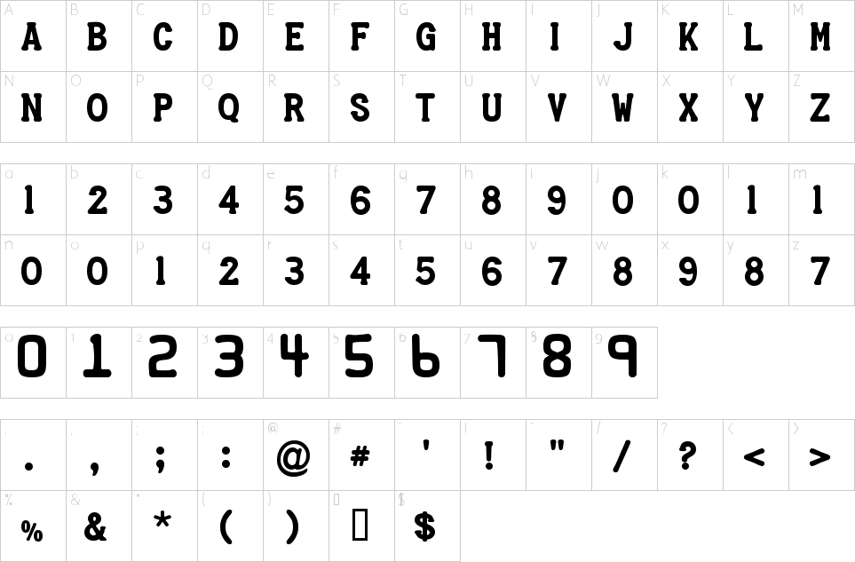
Credit Card is an all capitals font for simulating bank cards. Capital letters are positioned at the uppercase keystrokes as expected. The number keys produce the bigger, squarer digits of the 16 figure card number. There is no lowercase to this font. Instead, the small numerals used for validity dates fill the lowercase letter keys, 1 > 9 being at a > i. As on actual credit cards, principal glyphs are monospaced with no pair kerning, and many accented letters are reduced in vertical size to help accommodate the diacritic.
Credit Card Font Preview
Credit Card Font Character Map
Font NameCredit Card Font
Design Date16 Feb 2025
Designer(s)K-Type
PublisherK-Type
Credit Card Font Glyphs
- a
- b
- c
- d
- e
- f
- g
- h
- i
- j
- k
- l
- m
- n
- o
- p
- q
- r
- s
- t
- u
- v
- w
- x
- y
- z
a
Language support
273 languages available