What is the Conglomerate font?
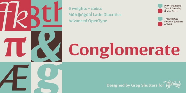
Sans or serif? Square or rounded? Calligraphic or geometric? Conglomerate is both all and none of these things — a subtle yet unorthodox blend of typographic traits resulting in a clean, unique, and versatile font family with large, open counters for legibility in text yet crisp, sharp details that sparkle at display sizes. Conglomerate is sturdy but never stiff, crisp but never stark — perfect for projects that require a more contemporary feel than either a traditional serif or geometric sans might bring. More…
Each style also contains an extensive set of OpenType features for quality typesetting — including small caps, proportional, tabular, lining, and oldstyle numerals, case-sensitive punctuation, ligatures, arbitrary fractions, localized forms, and elevated, underlined ordinal indicators for English, French, Spanish, Italian, and other languages. TTF versions have also been manually hinted for optimum screen clarity on Windows and the web.
Conglomerate Font families
The Conglomerate includes the following font families:
- Conglomerate Light
- Conglomerate Light Italic
- Conglomerate Book
- Conglomerate Book Italic
- Conglomerate Medium
- Conglomerate Medium Italic
- Conglomerate Demi
- Conglomerate Demi Italic
- Conglomerate Bold
- Conglomerate Bold Italic
- Conglomerate Black
- Conglomerate Black Italic
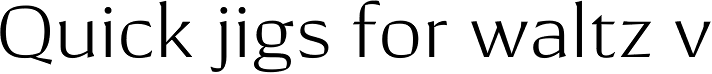
Conglomerate Preview
Here is a preview of how Conglomerate will look. For more previews using your own text as an example, click here.