What is the Chopsee font?
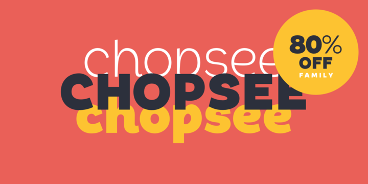
Chopsee is a fun, fluid, versatile font family of 8 weights and matching italics designed by Dan Jones for TypeUnion.
The font aims to encompass movement and fluidity with its accentuated curves and terminals. The raised x-height creates more synergy between the lowercase and uppercase characters thus enhancing the visual appearance. More…
The family of 8 weights & italics means you have plenty of usage options whether digital, branding or print – Chopsee black is perfect for that new brand idea you have, while the lighter weights provide a subtle support to clean layouts whether it’s call out text on a website or in print applications such as posters or magazine layouts.
Chopsee Font families
The Chopsee includes the following font families:
- Chopsee Thin
- Chopsee Thin Italic
- Chopsee Light
- Chopsee Light Italic
- Chopsee Regular
- Chopsee Italic
- Chopsee Medium
- Chopsee Medium Italic
- Chopsee Semi Bold
- Chopsee Semi Bold Italic
- Chopsee Bold
- Chopsee Bold Italic
- Chopsee Extra Bold
- Chopsee Extra Bold Italic
- Chopsee Black
- Chopsee Black Italic
Chopsee Preview
Here is a preview of how Chopsee will look. For more previews using your own text as an example, click here.