What is the Arquitecta font?
Arquitecta. The humanist typography as a rational project.
Since the experimentation from the Bauhaus through modern sans history we looked for a new mix to construct a rational geometric typeface with humanist proportions suitable for text layout and continuous reading.
Inspired by American & European hand lettering from the first half of the past century, Arquitecta finds his own space as a great alternative for paragraphs in front of classics like Futura, Kabel or Avant Garde. More…
The family contains 8 upright romans and 8 italics with the following features:
– European accents, Old Style Numbers, Numerators & Fractions.
– Ink traps to avoid press impressing spots & hinting optimized.
– Small X-height with accentuated ascenders and descenders.
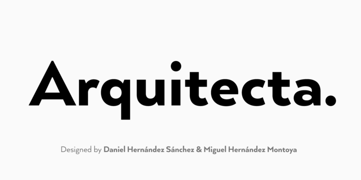
Designed by Daniel Hernández Sánchez y Miguel Hernández Montoya between the months of August and December of 2013.
Arquitecta Font families
The Arquitecta includes the following font families:
- Arquitecta Thin
- Arquitecta Thin Italic
- Arquitecta Light
- Arquitecta Light Italic
- Arquitecta Book
- Arquitecta Book Italic
- Arquitecta
- Arquitecta Italic
- Arquitecta Medium
- Arquitecta Medium Italic
- Arquitecta Bold
- Arquitecta Bold Italic
- Arquitecta Heavy
- Arquitecta Heavy Italic
- Arquitecta Black
- Arquitecta Black Italic
Arquitecta Preview
Here is a preview of how Arquitecta will look. For more previews using your own text as an example, click here.
