1514 Paris Verand Font
alphabet
0 Styles
Naa Design
Kind words and forgiveness are better than charity followed by hurt
0
0 reviews
Best usage: Body, Display, Logo
No Styles
1514 Paris Verand Examples
48pxKind words and forgiveness are better than charity followed by hurt
36pxKind words and forgiveness are better than charity followed by hurt
32pxKind words and forgiveness are better than charity followed by hurt
20pxNo one shall be subjected to arbitrary arrest, detention or exile. Everyone is entitled in full equality to a fair and public hearing by an independent and impartial tribunal, in the determination of his rights and obligations and of any criminal charge against him. No one shall be subjected to arbitrary interference with his privacy, family, home or correspondence, nor to attacks upon his honour and reputation. Everyone has the right to the protection of the law against such interference or attacks.
16pxEveryone has the right to freedom of thought, conscience and religion; this right includes freedom to change his religion or belief, and freedom, either alone or in community with others and in public or private, to manifest his religion or belief in teaching, practice, worship and observance. Everyone has the right to freedom of opinion and expression; this right includes freedom to hold opinions without interference and to seek, receive and impart information and ideas through any media and regardless of frontiers. Everyone has the right to rest and leisure, including reasonable limitation of working hours and periodic holidays with pay.
Recently Added
About 1514 Paris Verand
Details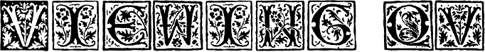
What is the 1514 Paris Verand font?
This set of initial decorated letters was inspired by a font in use in the beginning of 1500s in Paris. Exactly, we have used the set that Barthélémy Verand employed for the printing of Triumphus translatez de langage Tuscan en François, (from “Triumph” of Petrarque) in the year 1514. Some letters, lacked, have been reconstructed to propose a complete alphabet. It appears that the printer used some letters to replace others, as V, turned over to make a A, or D to make a Q. More… The original font’s letters were drawn in white on a black background only, but it was tempting to propose a negative version in black on white. It is used as variously as web-site titles, posters and flyers design, publishing texts looking like ancient ones, or greeting cards, all various sorts of presentations, as a very decorative, elegant and luxurious additional font. This font supports strong enlargements remaining very smart and fine. It’s original medieval hight is about one inch equivalent to about four lines of characters. This font may be used with all blackletter fonts, but works particularly well with 1543 Humane Jenson, 1557 Italic and 1742 Civilite, without any anachronism.1514 Paris Verand Font families
The 1514 Paris Verand includes the following font families: [font-families]1514 Paris Verand Preview
Here is a preview of how 1514 Paris Verand will look. For more previews using your own text as an example, click here.Font Name1514 Paris Verand
Design Date1 Jan 2008
Designer(s)Naa Design
PublisherGLC
1514 Paris Verand Glyphs
No Data
Language support
0 languages available